Our Annual Retailer Site Performance Review: The Bad News
A few of my more recent articles here in this newsletter have called out the good news from our annual retailer website evaluation. It’s where we take an in-depth look at 80 different retailers’ desktop and mobile sites, compare them to 1,000 US consumers’ sentiment, and then rank them across a pretty grueling set of criteria. We’ve been doing it for several years now, and while the results have historically been pretty grim, this year, we found retailers had hit something of a turning point: there was more good news than we had become accustomed to.
Unfortunately, some less than stellar trends also reemerged. For example, it turns out that all of the 3rd party functions retailers are adding to their sites (which should be a good thing!) – are actually slowing those sites down – and shoppers are vocal: they are clearly frustrated by slow sites.
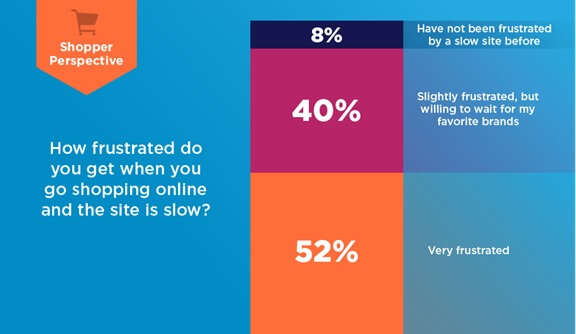
Figure 1: …92% Of Shoppers Are Frustrated Due To Slowness
 >
>
Source: RSR Research, July 2020
In fact, only 9% of shoppers report this as not being an issue, with 52% citing it as a major sore spot. With all we’ve seen so far about the massive shift to shopping online currently taking place around the globe, this is no time for retailers to be slow.
Shoppers Aren’t Going To ‘Hang In There’ With Your Brand Anymore
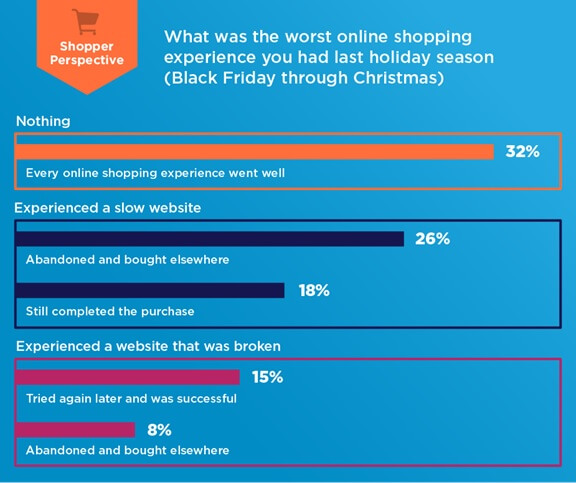
In keeping with this “no time to be slow” theme, consider what shoppers told us about what they recall from their shopping experiences this past holiday season (Figure 2).
Figure 2: Shoppers Had A Blue Christmas

Source: RSR Research, July 2020
With only 32% of shoppers reporting no issues, more than 2/3rds of shoppers recall real problems – and this is information gathered six months after the fact. They’ve had time to forget the temporary challenges they experienced: and don’t.
With that as a backdrop, it is frankly inexcusable that several of the most respected brands in retail offer up mobile sites that load as slowly as they do. Due to COVID-19, traffic is already at holiday levels and will stay higher forever; retailers must fix this before the upcoming holidays and before the next report.
Brands like Under Armour, for example – which featured some of the most compelling content of any retailer we evaluated, scored poorly here. For a web offering this solid to score only 10 out of 27 points for page load times seems like a genuinely missed opportunity. Adidas (the overall winner of this evaluation just a few short years ago), only scored 12 of 27 available points here, and Neiman Marcus – long lauded for putting customer service at the top of its value offering – only scored 13 points. This is a clear indicator that too many strong brands are continuing to sacrifice speed at the altar of high-quality functionality and content. The best brands will absolutely strive for both.
Too Many Retailers’ Cross Channel Experience Is Deeply Lacking
Just as we saw many brands succeed in folding vast amounts of desktop site content into the mobile format in creative and interesting ways, so, too, do we still unearth a plethora of retailers whose cross-channel experience is deeply lacking. This is one of the most troubling findings of this research, as at its core, what it exposes is that many retailers are still not shopping their own sites.
–Walgreens, by way of comparison, just shoehorns all of the content from its desktop site onto its mobile offering, completely ignoring the long-known fact that shoppers use and view their mobile devices in radically different ways than they do a desktop
–Sears goes so far as to cut some features from its desktop site (the “Items you may be interested in” section, for example, is missing from its mobile site) and then makes many of the big block promotions that take up the majority of its desktop homepage and animates them in the hero on the mobile site. It also converts other lengthwise desktop sections (“Best sellers”, for example), and converts them to horizontally presented scroll bars on mobile. This is a technique we applauded other retailers for earlier in this report, but Sears bungles the technique entirely: it offers no clear indicator that this is an option until the user tries it. There are no dots beneath the images, no half images to the right, no arrows: nothing
–Overstock, no doubt due to its vast and ever-changing inventory, just keeps all of the content from desktop to mobile the same and lets the mobile shopper scroll until the end of time – never reaching the bottom – it just keeps replenishing
–LOFT, for example, features entirely different promotions on its mobile site than it does on its desktop. This results in shoppers starting to game one channel against another – at the same brand
-And in a twist we’ve never seen before, Gettington (a Bluestem Brands retailer) features significantly more content on its mobile site than its desktop, no doubt revealing a culture where mobile and desktop management are siloed from one another
It is difficult to believe, four consecutive years into this research, that we are still discovering such obvious oversights.
We invite everyone to read the full report here.
