And Now, For Some Good News
Each summer, we look at roughly 80 retailers from 50-150 on Internet Retailer 500 list and evaluate their online offering. At the root of this research is the assumption that website speed matters, design and promotional content layout matter, the desktop site’s parity to the mobile site matters, ease of checkout matters, etc. To confirm or refute this assertion, we also ask roughly 1,000 US-based shoppers to weigh in on the very same questions, and the resulting report offers up a virtual “report card” for the retailers we’ve examined. This year’s overall winner was Ralph Lauren. They scored well, collecting 42.5 points out of the 54 on offer, or the school grade equivalent of a C+.
By the same token, the average retailer score was a failing grade by a long shot, earning only 57% of the points that were available, and if you read the full report (available here), you’ll know there’s lots of bad news in there about the money retailers are leaving on the table.
But what about the good news? We could all use a little of that these days, right?
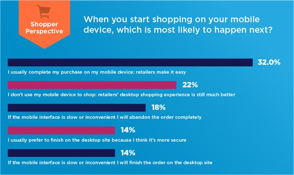
Well, for starters, retailers’ mobile efforts continue to improve. Consumers’ confidence in the mobile channel’s ability to be their one-and-only point of interaction is growing at a staggering rate. Nearly one out of three shoppers report that their standard operating procedure is to now complete an entire transaction on their mobile device, a percentage that would have been unheard of even a few years ago. Whereas “Cyber Monday” was not-long-ago born out of consumers’ need to use their employers’ high-speed office connections to start their holiday shopping after a long Thanksgiving weekend, today, only 22% of shoppers say they prefer to conduct the entire experience on a desktop computer at all.
Figure: Only 32% Of Shoppers Think Retailers Make Mobile Easy

Source: RSR Research, July 2020
This trend serves as the motivating reason we amended our criteria this year, choosing to focus primarily on retailers’ mobile performance. In fact, only a small section of scoring took into account desktop sites, and not even for the sake of site performance. A total of 3 points (in the Shopper Experience Section) were allocated for the purposes of ensuring that both desktop and mobile offered the same quality of experience, and purely from a content point of view.
As a result, the mobile performance perspective (including such things as time to first byte, home page rendering time, product detail time to complete, delta between fastest and slowest load times, etc.) made up the largest section of our scoring system this year – 27 of the 54 points available.
The two best sites evaluated here were our overall winner (Ralph Lauren), and Lands’ End – both chalking up a commendable 24 out of the 27 points available in the category. A number of brands we tested were close behind such as Newell Brands (22/27), while LOFT and last year’s overall winner, Backcountry.com both racked up 21 out of the 27 points in play here.
Some more good news?
Pandemic Messaging Was Well Executed
One of the most interesting things about this year’s research is that as we were conducting our evaluations, most physical stores were in a state of complete lockdown due to the coronavirus. As a result, brands’ websites featured a vast array of communications addressing the far-from-ordinary situation.
As one might expect, curbside pickup was being pushed by a large portion of retailers, some in more effective ways than others. Dicks Sporting Goods, Williams Sonoma, and Talbots all did a good job here; others (MidwayUSA) simply offered ship-to-store, with no mention of how those orders would be fulfilled at the store.
At the same time, many brands communicated all the different ways they were addressing COVID-19 precautions by simply adding an overarching popup (Lululemon, L.L. Bean), which, while achieving the objective, does also add an additional step for every shopper – COVID-concerned or not – to clear. This is something we’ve cautioned about several times in this ongoing research series, as when the answer to too many business questions becomes “let’s add another popup,” not only does site speed decrease, but the number of popups quickly becomes an annoyance to the online shopper.
Of all the ways to address these challenging issues, Luxottica (Rayban.com) and Chico’s took the cleanest approach: At Rayban.com, “We’re in this together” messaging is the first thing that greeted customers, not as a popup, but as a page header. Within, it explained how shipping would undoubtedly be affected, and the language used was inherently designed to place shopper and seller on level ground. At Chico’s site, the language was less folksy, but the message rang loud and clear at the top of the page: if you’d prefer to get your goods immediately, our stores will still be there to help.
We invite everyone to read the full report. While it is critical, for certain, it is done so in a way to help retailers improve – not to beat them down, while also providing a fully ranking of all the retailers involved.
And – there’s also a lot more good news within.
